
.svg)

How To Add High Contrast Value In A Design?
In the broader context of design, contrast is actually the process of utilizing opposites to attract attention. Contrasts are particularly useful while developing business communications, as they help maintain attention and ensure that you get your message across. In a simple aspect creating contrast is easy and fun. It can be done through the differences in the color, size, form, texture, and value of all objects in the composition. But, in reality, it is quite different. It can be challenging to understand when to apply contrast or what elements should be contrasted. That’s why we are here to help. As for the other techniques related to high contrast value in a design, – I’ll describe them to you further in the tutorial.
What Does High Contrast Mean In Design?
Contrast refers to a clear difference between two aspects that are similar in some way. For instance, light opposite dark, thick in contrast with thin, pastel colored opposed to neon, etc. Contrast can be used to bring focus to specific parts of your site and add a dramatic effect to your design. Color is one of the simplest yet most powerful techniques to play with a background and the primary color scheme. But do not be carried away by all these colourful examples. Contrast can be obtained not only by varying the colors but by other criteria also such as size, shape and etc.
Why Is Contrast Important In Web Design?
When contrast is maintained properly, this is a sure way to enhance the User Interface while at the same time enhancing conversion factors. Such as:
Readability and Accessibility:
High contrast between text and background helps improve readability and make content easier to digest. Readability satisfies better with black writing on white space rather than light gray writing on white space. For users with visual impairments, ensuring sufficient contrast is vital for accessibility. Your site design ensures that color blind users alongside people with low vision can easily engage with it.
Aesthetic Appeal:
Designs achieve superior visual aesthetics when designers apply contrast properly. The combination of darkness and light works as a depth layer to make various interface elements visible. Well, first of all, if all the details were the same, a design would be plain and uninteresting to the eye. Adding a bit of contrast, you have a better chance of capturing and walking the audience.
Draws Attention to Key Elements:
Contrast helps direct users’ attention to important features like buttons, headlines, or calls to action. When you use a vibrant button against a neutral background it naturally attracts viewers' attention to engage with the content.
How Is Contrast Used In Graphic Design?
How contrasts work through color, shapes, and size, as you have seen above. However, there are even more techniques to stay tuned.
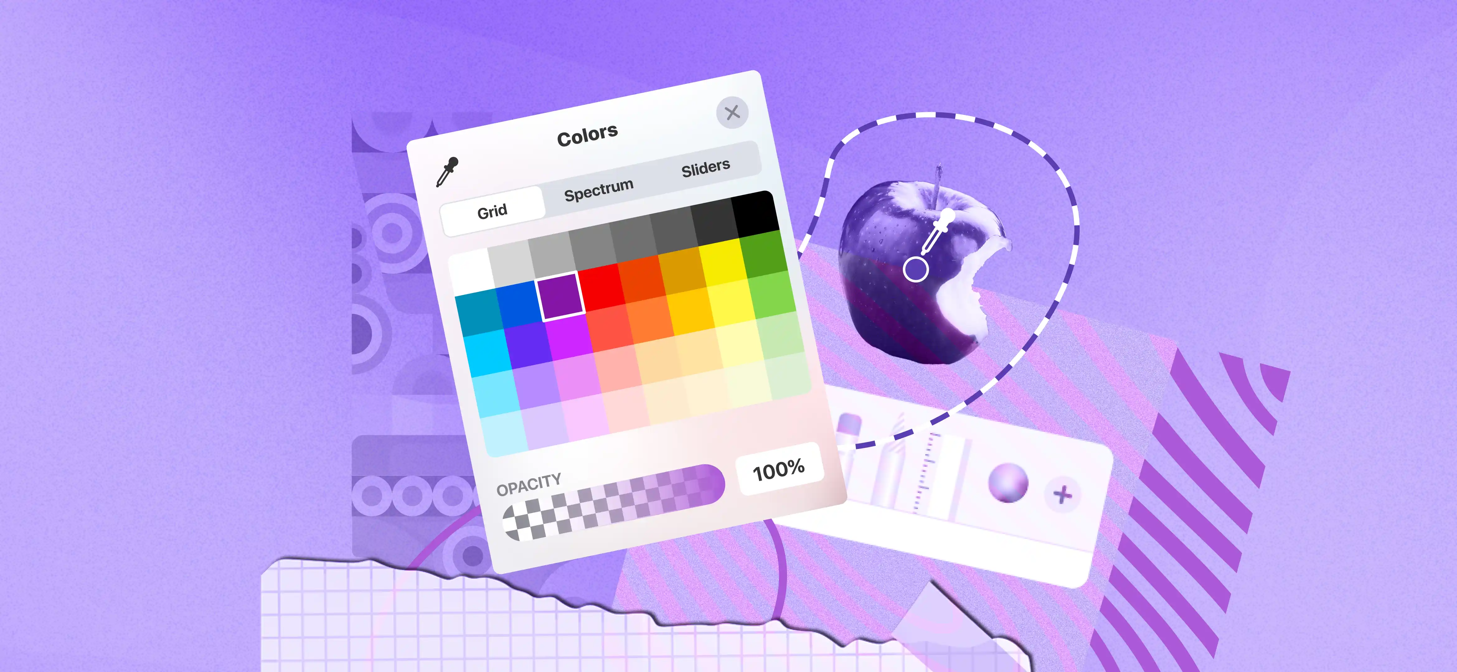
Contrasting Colors
In general, contrast is considered only in terms of colors. Thus, it would be expected that contrast in forms of design should be used in the form of colors frequently. Perhaps the simplest technique is to pick two colors at extremes of the color wheel. Use shadows, gradients, and highlights to create depth. For instance, you can add a drop shadow to buttons or cards to make them stand out from the background. Use light effects to simulate a 3D appearance for key elements. The brighter or darker shades of the same color, or color with lesser value or higher temperature can help to improve the designs, apart from the accessibility and readability.
Color selection from opposite sides of the color wheel such as blue with orange or red with green produces effective results. Dark or light elements should be paired to make each element really stand out from the design background. A button containing an orange color block will stand out when placed next to a wheelchair-disabled background.
Contrasting Shapes
In order to create some contrast there are many shapes that you can combine them in various ways. You can also place geometric shapes opposite organic shapes that derive inspiration from setting natural scenes. Organic shapes are largely random and complex and, on the other hand, geometric shapes have well-defined edges and repetitive curves. For instance, combine a rounded button on a layout with sharp-edged elements. You can also add texture to backgrounds while keeping foreground elements smooth and clean.
Contrasting Sizes
Size is another of the great ways of achieving some contrast you have always heard of. Your design takes on extra depth through visual contrast between different object sizes, illustration scales, text dimensions and other design elements. Size also relates well with the principle of visually dominant. Commonly, the size of objects placed within a given composition gives evidence of their degree of significance.
One thing you have to make sure is the contrast enhances readability and doesn’t overwhelm the design. Another example is increasing the size of the most significant parts, which catch the viewer’s attention first and become the key points in the design. The first typographical feature that you should focus on is the large H1 title—if it is, the contrast by size is used properly here!
You can use size contrast to emphasize hierarchy. Make the main heading appear more prominent than both subheadings and body text using a significantly larger font size. Apply size contrast to images or icons to guide the viewer's focus.
Contrasting Textures
While designs may not possess the physical texture, they are certainly not without visual texture. That is texture in design deals with how the surface of an object is perceived by the senses to feel. Not to mention that often, visual senses can be as sharp as even the most sensitive of physical perceptions! Another interesting way to call texture in design is the geometric or even natural photography even using a simple background. If you want to make contrast using texture all you have to do is place another element with no texture, for example, you can put it on a smooth area.
Contrasting Tone
In design, it’s also possible to specify that elements can have another value usually termed tone. Tonal values range from pure black (low value) to pure white (high value). In other words, there is a value which refers to how light or dark the element looks. You can generate design contrast through varying values that exist within the same project. A gradient of tone results from designers ordering different gray shades to build complexity in designs. Tone variation within a single color palette produces depth that builds a sophisticated layered appearance. The black-and-white design uses tonal transitions as its sole attention guide while also maintaining content structure.
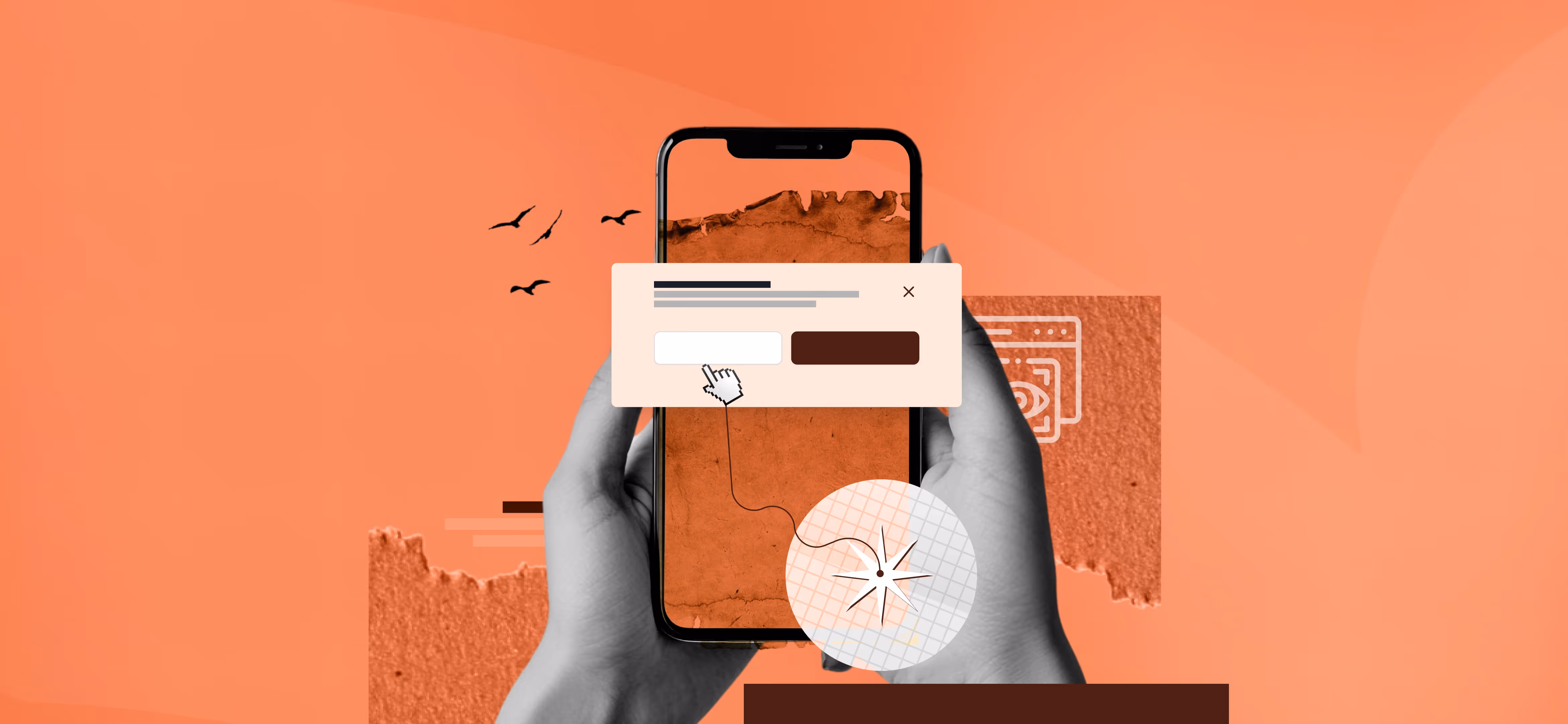
Contrasting Positions
The use of differentiation in positioning is very effective in the creation of a hierarchy of materials and stressing key components in the design. Here, it is possible to find such positioning techniques as placing certain items on the web page to demonstrate how unique and valuable they may be. Locating a specific set of items relatively far from the other ones will occupy less space and attract more attention. Use symmetrical layouts to break the monotony and direct attention to specific areas. Align key elements off-center or away from traditional grids to create visual interest. For instance, position a headline slightly off-centre on a landing page to add dynamic energy.
Place important elements (like a CTA button or key visual) away from clustered groups. For instance, a single image or product placed in the center of an otherwise empty page creates a focal point.
Placing an item along a visual flow line or at the termination of a directional cue can make it a focal point. For instance, on a homepage, position a "Learn More" button directly below a downward-pointing arrow to guide users.
Contrasting Directions
The concept of directional contrast deals with the utilization of the up and down, as well as the left and right, lines and angles making the design appear dynamic in its energy. Each type of direction can have a certain effect on a design and consequently on its further perception by the spectator. Such as:
- Horizontal alignment means a set of items placed from left to right for example all the text or the image that is aligned from left to right direction.
- Vertical alignment, where the items are placed from top to bottom for example the columns of text or images aligned vertically.
- Diagonal position, in which objects are arranged in a diagonal form, embodies the sense of motion and energy.
- Radial direction places the elements in a circle form or radial fashion in order to give a sense of movement toward a certain focal point.
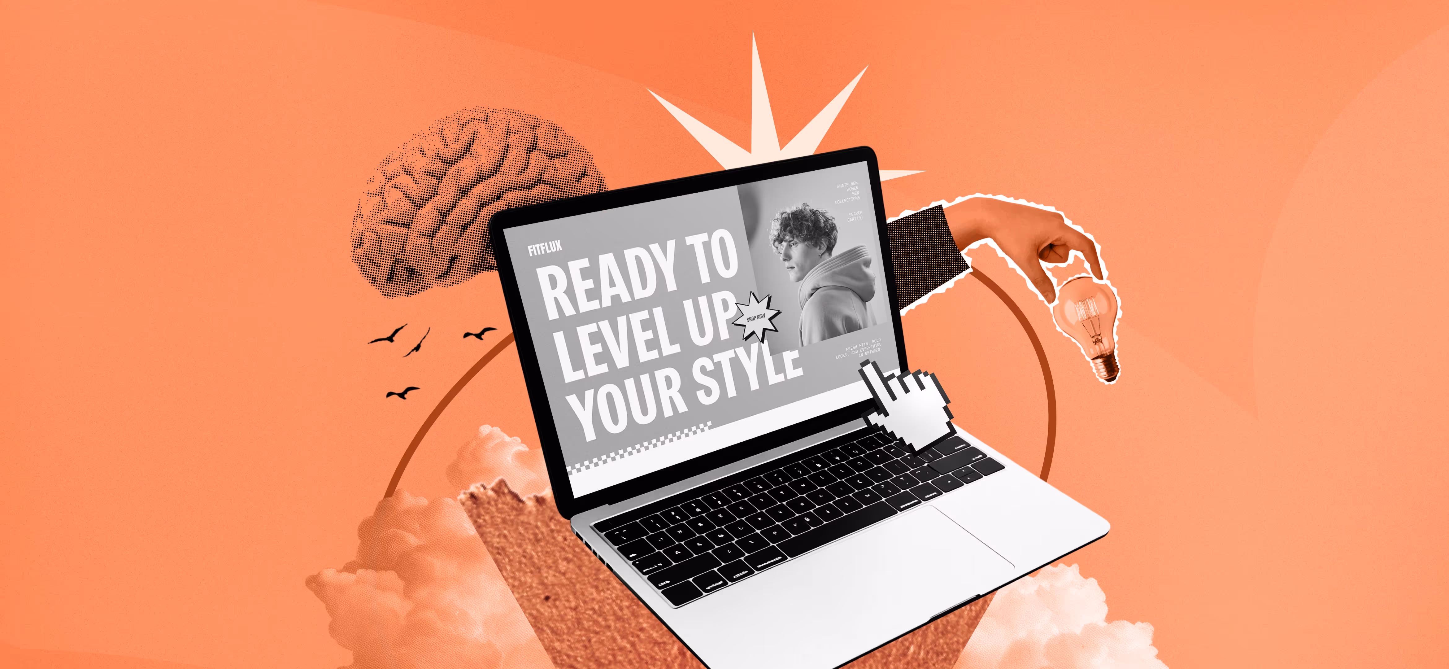
Contrasting Elements
In design, elements refer to the items that can be used to make compositions that convey particular ideas. To create some good and meaningful artwork, the designers always have lots of tools available to them like form, contour, hue, surface, tone and typeset. If properly mixed and matched, different aspects pertaining to the designs can greatly improve structure. It is a perfect example of a large and a small mockup along with an interface component or a button, a giant image and strokes with a creamy hue. All of these elements are used with the goal of changing the composition of the mixture and/or focusing the viewer’s attention on chosen parts of the picture.
Contrasting Spaces
Contrast can also be achieved when placing objects far away from others. It is very important in giving the ‘overall look and feel’, space and order on a page to enhance usability. Some key elements of space contrast:
Negative Space (Whitespace)
The area which extends beyond web content is recognized as negative space or whitespace. Negative space provides breathing room for content. It keeps designs clean and organized. You can take, for instance, a clean website layout with ample margins around text and images.
Positive Space
It refers to the areas occupied by design elements, such as text, images, and buttons. You can create contrast by balancing positive and negative space.
Proximity and Separation
Organizing elements close together makes a relationship between them. At the same time, spacing elements far apart creates distinction and draws attention to individual items.
Accessibility Contrast Requirements:
Color perception is a little different among individuals, which affects their interaction with your site. That is why it is essential to understand that you do not perceive colors as any other person does and you better exert much effort to make the best web design. But do not forget that it is impossible to design to meet everyone’s opinions – there will always be some people who will not understand your design. However, we should not miss the opportunity to work as hard as possible to develop universally appealing and relevant products to form the first impression on our prospective customers.
Clarity
Your users must be able to read and differentiate all the information displayed on the screen or page. Much attention should be paid to color and its combinations; all design features should provide clear and easy navigation, and thus emphasize such practically important aspects of the layout.
If you take this point too lightly, your users will most likely be left to navigate a confusing and messy website. The above situation may create confusion and misunderstanding for your audience, something that should not be encouraged by any UX designer.
Readability
Due to low readability, readers may lose useful content or may get annoyed at the time they need to spend to read the material. This may make them stop using your product, otherwise they may have been interested in it.
To avoid such a tricky issue, first of all, you should attend to different devices that your audience will use to engage with your product. Make sure all things are in the right place, be it a desktop or a mobile version of the website. Also, it is essential not to use ordinary colors. These colours make text barely visible when put against a background color that is too close in tone.
Accessibility
Accessibility is the practice of creating products for people with disabilities will also can understand. This includes the physically disabled persons; the aging and those with other complications which make them hard to find products which are easy to access. The concept of accessibility is to achieve a point where the decision to use a particular product is independent of the user’s physical capabilities. For instance, when choosing a color scheme, the designers should think about the basics of different users with various needs or disabilities.
Wrapping Up:
As explained in the article, there are various forms of contrast available to the designers. These include colour, touch, form, area, orientation, and placement. If you decide to work with these contrast techniques, you should find out the optimal level of contrast. If the contrast level is too low, the final result may seem monotonous and if it is too high it can cause severe distraction and navigation problems.

Read our latest blogs and resources
Reach Out Anytime Connect with Our Team
.svg)


