NewLife Naturals - Healthcare Landing Page Design (UI/UX)
NewLife Naturals supports the menopause journey with all-natural, pure products free from chemicals, GMOs, and artificial additives, promoting confidence and well-being.
ECOMMERCE
UI design
UI/UX DESIGN
WEBSITE
Category
Health and Wellness
Release
2025
Timeframe
2 Weeks
Overview
01
Introduction
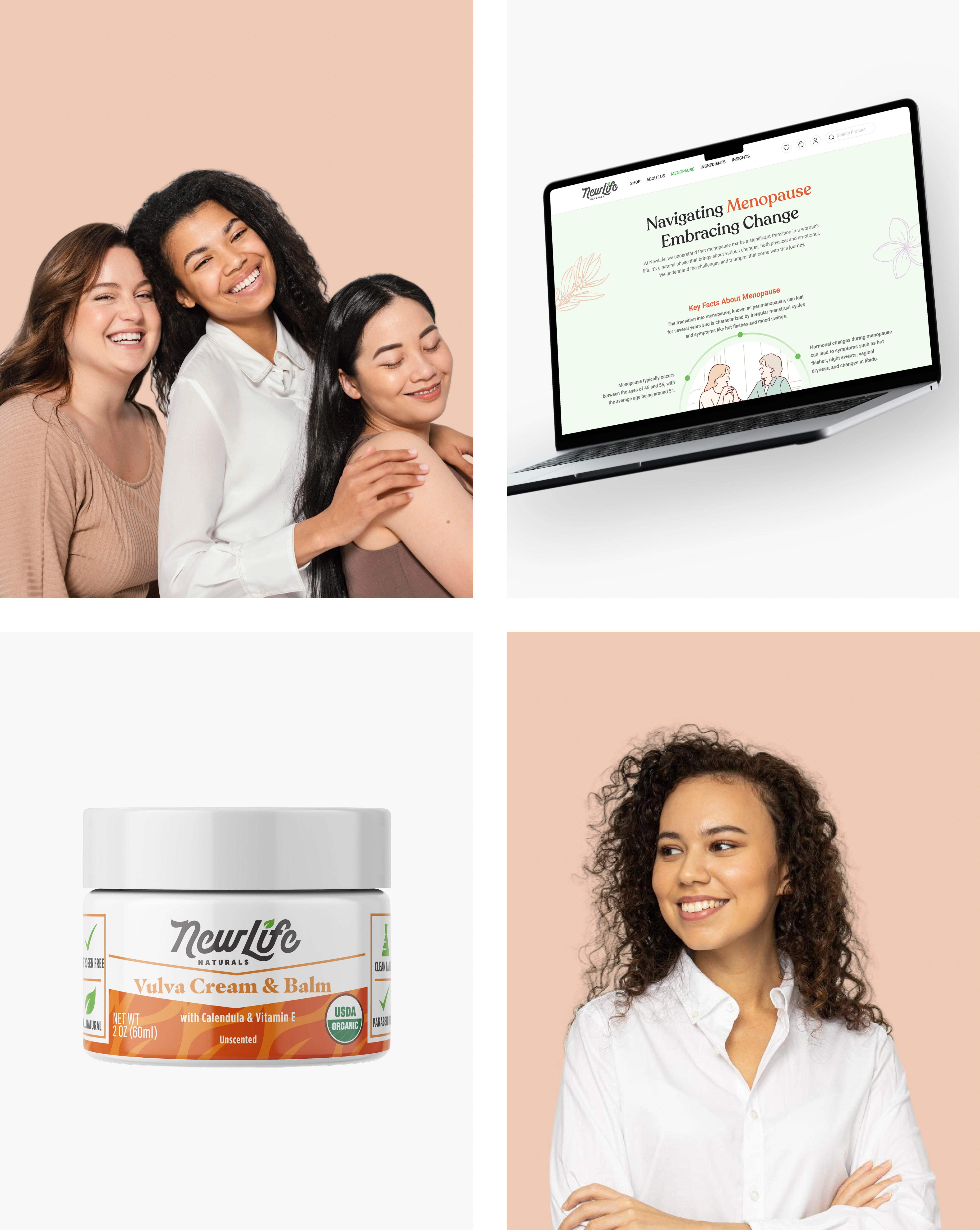
NewLife Naturals is revolutionizing feminine care with a mission to educate, inspire, and empower women to live their best lives through clean-label products. The brand promotes a healthier, more natural, and fabulous quality of life.
Client
NewLife Naturals
Services
ECOMMERCE
UI design
UI/UX DESIGN
WEBSITE
Discovery
02
The client
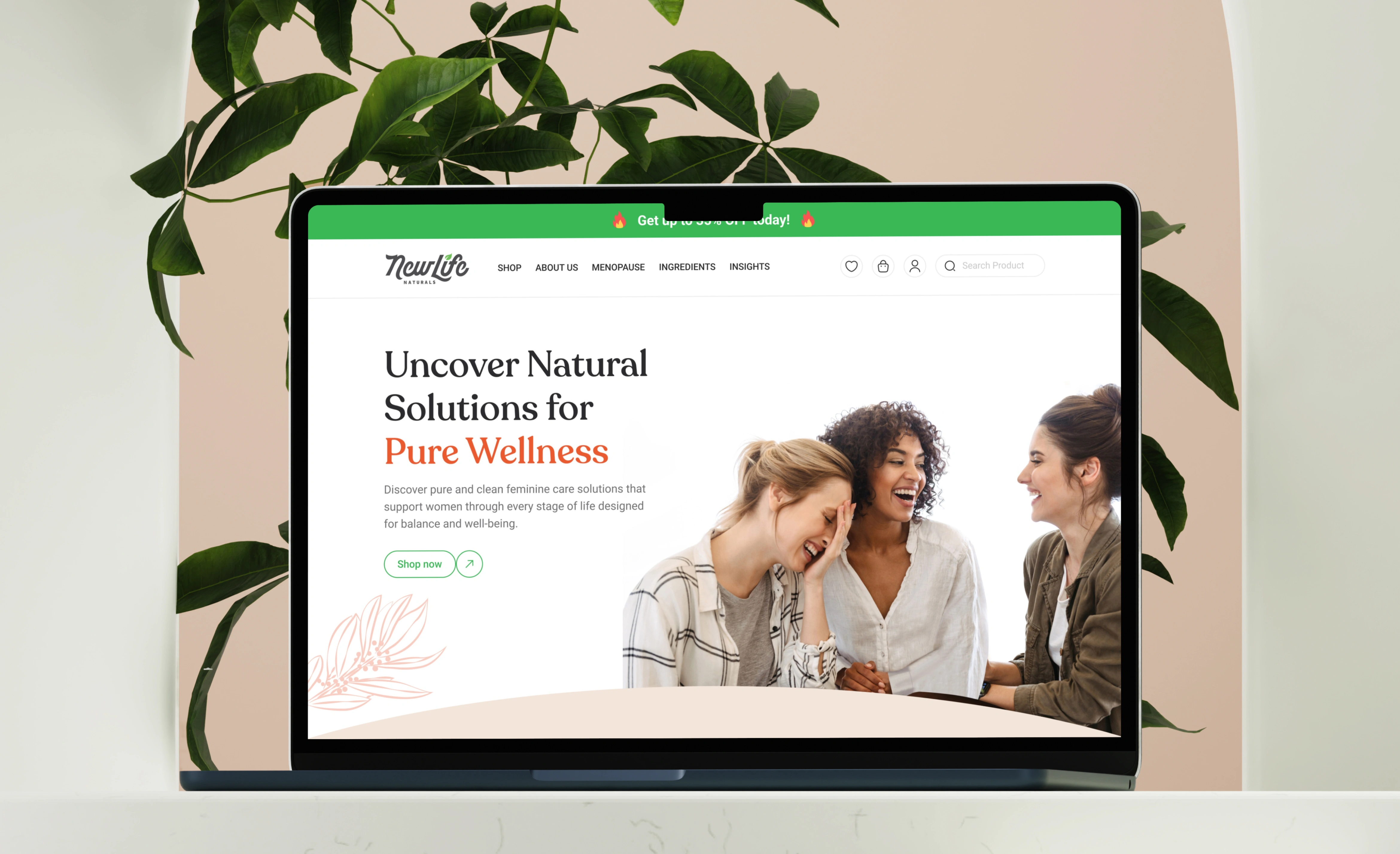
NewLife Naturals is redefining feminine care with a bold approach to women’s wellness. Far from being an average brand, it stands as a trailblazer, offering safe, effective, and natural alternatives. Committed to clean-label products, NewLife Naturals uses all-natural ingredients designed to support the body with confidence and vitality. Dedicated to empowering women at every stage of life, the brand is on a mission to revolutionize feminine care naturally—and it’s bound to be epic.
Problem & Challenges
03
The challenge
Designing the NewLife Naturals website involved balancing bold branding with approachability, simplifying navigation, and ensuring accessibility. Solutions included vibrant visuals, clear categories, trust-building elements like testimonials, and empathetic CTAs, creating a user-friendly, empowering experience.
Problem
Translating NewLife Naturals’ bold brand voice into a confident yet approachable design without overwhelming users.
Solution
Used clean, modern visuals with vibrant colors, bold typography, and sassy microcopy to balance empowerment and usability.
Problem
Women navigating sensitive life stages may feel alienated by overly aggressive marketing tactics.
Solution
Used empathetic design with gentle CTAs like “Explore Solutions” and subtle prompts for sign-ups and free resources to build trust before purchases.
feature
04
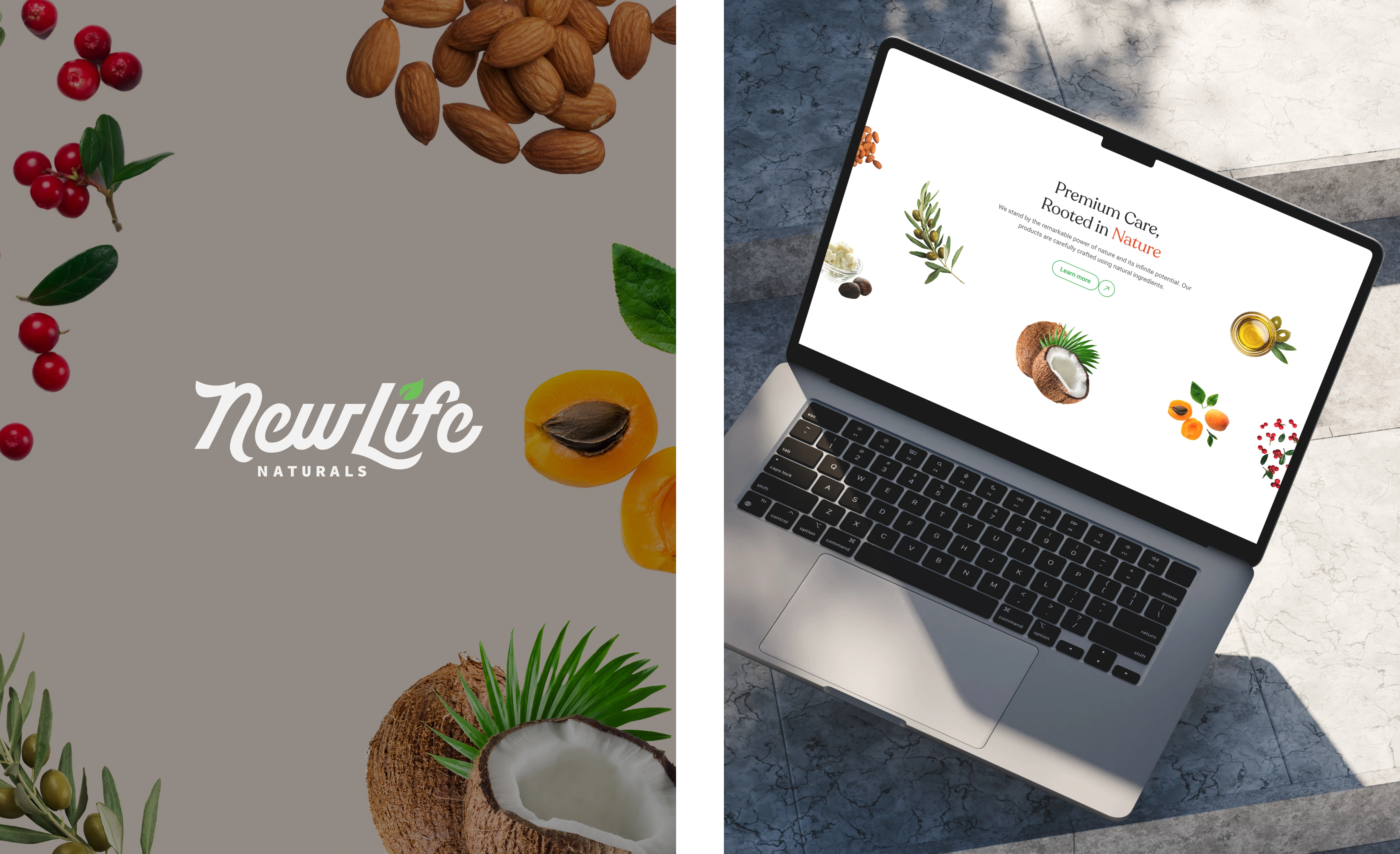
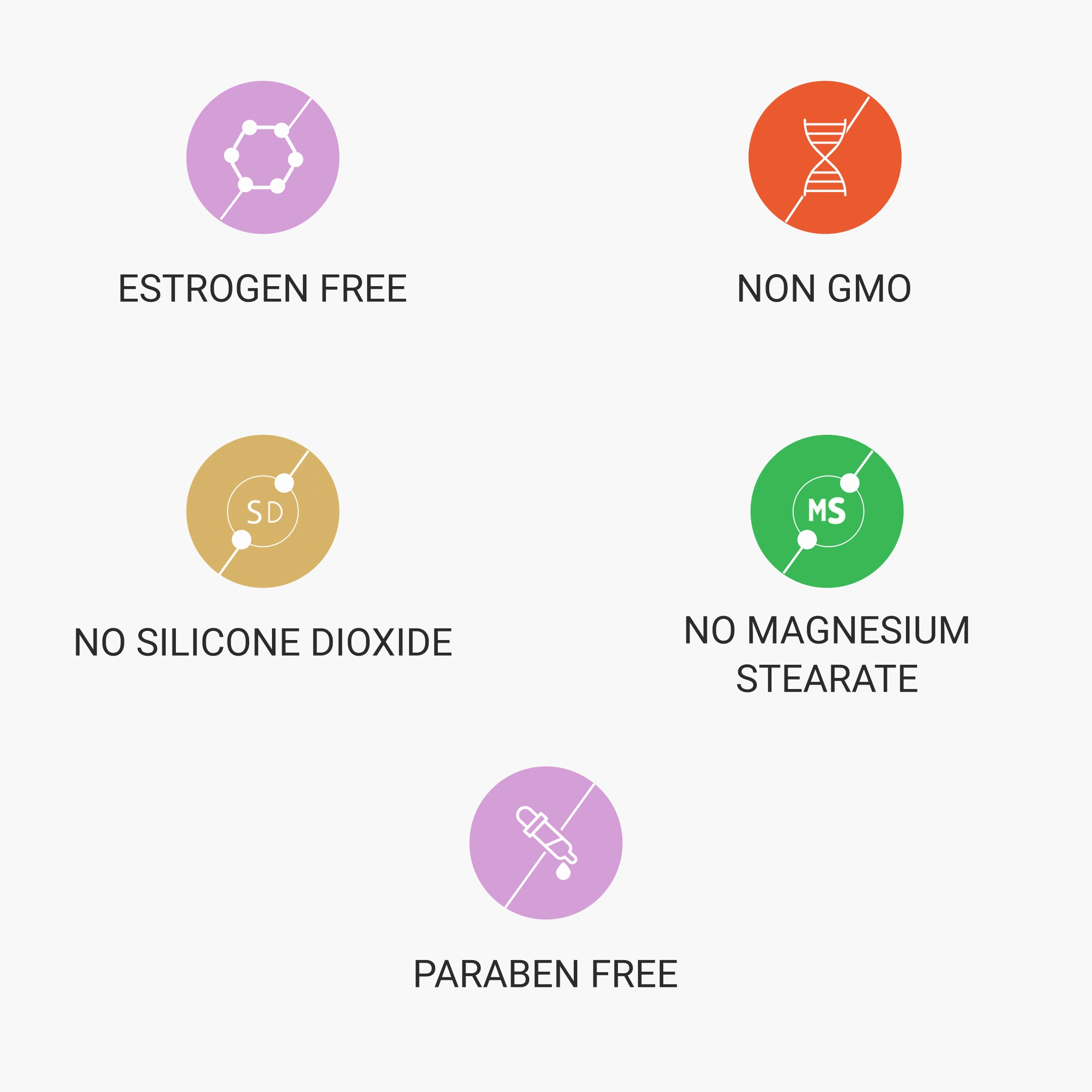
Featuring Ingredient Integrity
The Ingredient Integrity feature highlights the purity and transparency of product formulations, building trust and reinforcing the brand’s commitment to wellness.
- Overwhelming or overly technical information can confuse users. Present details in a simplified, visually appealing format with icons to ensure clarity and accessibility.
- Generic visuals may fail to convey ingredient quality effectively.
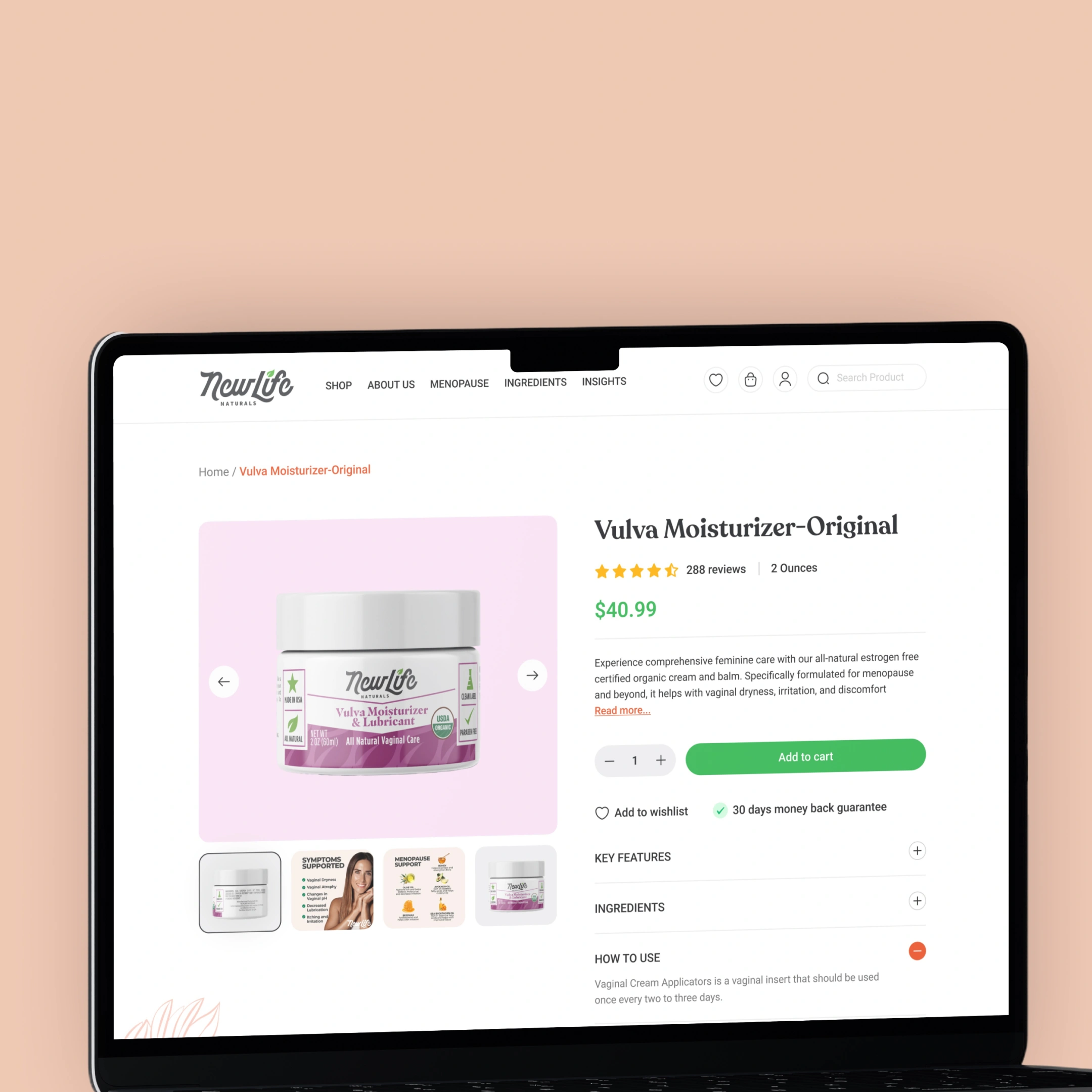
Product details page
Product Details Page is crucial for showcasing product value and encouraging purchases. Designing this page requires addressing clarity, engagement, and functionality challenges.
- Cluttered layouts can confuse users and obscure key information. A clean, well-structured layout with clear sections for product descriptions, benefits, and usage instructions to ensure easy readability.
- Multiple-image slider with high-quality visuals to showcase the product. Drive conversions with a prominent “Add to Cart” button.
Order again
Category Filter feature enables users to easily refine their search and explore product categories, improving navigation and user experience.
- Overcrowded filters can overwhelm users and hinder selection. Clean, organized list with clear headings and concise labels to maintain clarity and simplify navigation.
- Unclear filter options can reduce user engagement. Ensuring each filter is easy and understandable, enhancing the user’s ability to quickly find what they need.
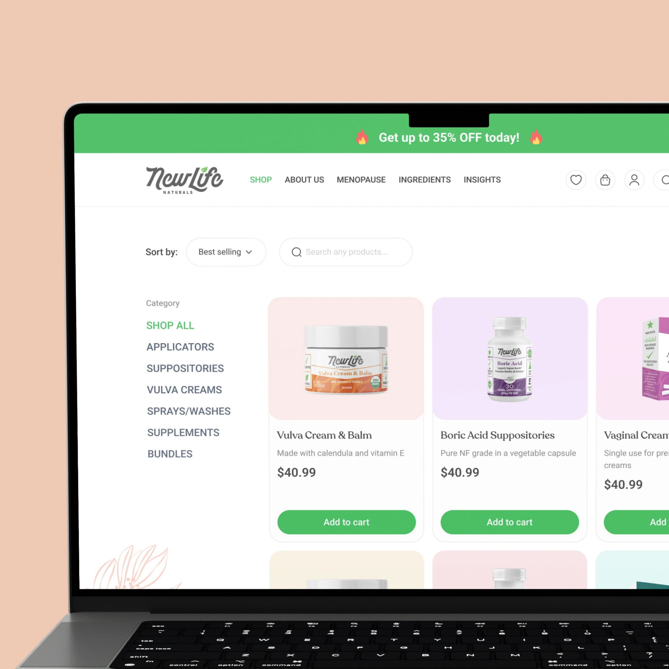
Trending product
Trending Product section showcases popular items to drive user engagement and boost sales.
- Cluttered layouts can distract users from key products. Use a clean, well-spaced grid layout with clear product names and images to highlight the most popular items.
- Irrelevant or outdated products can reduce user interest. Ensure the products displayed are regularly updated based on real-time data to maintain relevance and keep the section fresh.
Conclusion
05
Impact
The design NewLife Naturals website makes browsing easy with clear navigation, clean layouts, and engaging features. With product sliders, helpful filters, and bold CTAs, it creates a smooth shopping experience. The design reflects the brand’s natural ethos, building trust and connection with users.

“Very good at what they do. A top-tier website redesign that received positive user feedback, increased clicks, and helped boost web traffic and brand awareness.”
Danny Modab, Co-Founder and CEO

.svg)
.avif)